For questions that require a selection between alternatives, you should select this option.
Multiple Choice questions have three modes of editing. The default mode is Simple View, where some features are hidden. By clicking on Advanced View more advanced features like label position and support for images are enabled. Switching back to Simple View will not delete values already set, but will simply hide them from view. Quick Edit is a way of editing all choices in one single text area, where each line represents one choice. This feature is disabled when images are enabled in choices.
Simple view: For each choice you can set up the following attributes:
- The choice label. Type in the text to be displayed. In most cases this is the only thing you need to enter. Click Tab to go to the next choice label.
-
Edit-buttons. To make editing the multiple choice question easier, buttons are provided to move choices up and down, and to delete. To move up or down, hold the up/down button and drag the mouse. When deleting, all choices after it will be moved one position up. When you input text into the last field, a new field is added. If you want to insert a new field, just add a new field and drag it to the position you want.
Additional multiple option features:
In addition to the attributes described in simple view, you can also set up additional features, that can be turned on and off by clicking on the corresponding links. The link is highlighted when there is a non-default value for at least one option.
- Image. Each choice can include an image. If you want to use images you need to enable them first by turning on the enable image checkbox. To add an image, click on the small image-button. You can either select an image, or upload a new image from the dialog box that will appear. See the section called “Images”.
-
Image alignment. This will indicate the position of the image, relative to the text and button. The alignment choices are:
- image right
- image left
- image top
- image bottom
Example of using images:
In this example, the button alignment was set to "bottom" (relative to image/text), and the image alignment is set to "bottom" (relative to the text).
-
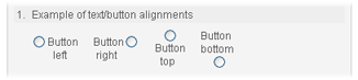
Label position. Position of the option label relative to the selection button. The possibilities are:
- button right
- button left
- button top
- button bottom
Example:
-
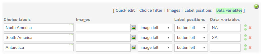
Data variables. Headers for this question response to be used in raw data and SPSS reports. There is one data variable per option when multiple selection is on and one data variable per question for single selection question. In addition you can have a data variable for the "other" field when it is enabled.
Quick edit: Each choice is copied into a larger text area field. In this view, each line represents one choice. This is similar to the editing of dropdown questions. When pressing OK, the values from the text area field will be copied back into the choice labels.
Choice filter: This makes it possible to filter out (disable or hide) choice options when respondent selects another optoins. Clicking on the "Choice filter" link will open a popup editor which makes it possible to select which choice will be filtered out. See the section called “Multiple choice filter”.
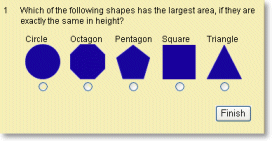
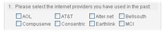
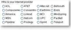
Options and Validations: Allow multiple selections: If this feature is selected, the choices for this question will appear as "checkboxes", meaning each option can be turned on or off. If this feature is not selected, the options for this question will appear as "radio-buttons", meaning only one of the options can be selected at any time. Example:
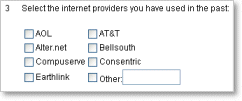
Last choice has text field for other: Includes a text-field for entering "other", if none of the other choices apply. The text field is of size 10, with 255 character maximum. Example:
Columns: The number of columns to display the choices. With many choices, more than one column will often look better. If more than one column is used, the choices will be displayed in this order (this example has 20 choices, displayed in 4 columns, alphabetically):
Selections required: This lets you control how many of the choices the respondent must answer (minimum selections). Set this to 3, and the respondent must select 3 or more options in the multiple choice question.
Allowed selections: controls how many choices the respondent may select (max selections).
Validation messages: lets you define what messages is given to the respondent if the requirements of minimum/maximum selections are not met.